image from kinsta
Get the joke? This app is definitely one.
If finding a job wasn’t difficult and tedious enough why extend it to the app? Why do I need one, when I only visit the site ever so rarely anyways? oh and its over 150mb to take up on your phone.
It begins with the home section of the app; a place where you can see the social aspect of linkedin. Great. So far so good...if you use that feature. We can assume that is their biggest goal as a company. We are able to write a post by pressing up on the top, or pressing the center plus button, again, a redundancy of user interaction. Finally see ourselves on the top left, messages on the top right and a mixture of buttons that really aren't placed where they need to be and a search bar that appears on every section.
Second, we see a dedicated button on the bottom for adding coworkers/friends; a priority over managing your own account, apparently, or messaging potential employers, We have recommended friends, a way to search, and a button on the right to do the same thing?
Alright, notifications... these guys usually are the ones that live on the top corner of every app, not on the bottom. That is my simple recommendation, just like we get used to navigation on the top of webpages, these should have a better common proactice.
Finally we get to the jobs section, thats why we came here. The search bar could have done it for us before...
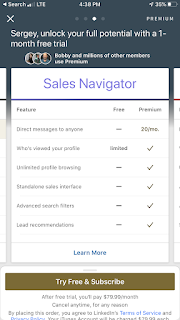
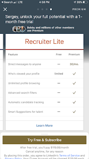
Whenever you do get messages, they live on the right. There you can compose messages... and guess what... another add friends button again? They are definitely pushing that social aspect aren't they? But just wait till I tell you that you need to pay to send messages!
It has come to us, to reach our own profile, we have to open up a side menu, then click view profile, now we can adjust our profile. YAY!
Are you sick of our notifications and want to limit who can write to you and more? well I'm glad you finally found the hidden settings menu after going through a few clicks, why was it not nested in the pullout menu on the left previously? Would be the most logical place for it wouldn't it?
Simply lets fix the navigation, prioritize buttons where they need to go, are in easy reach, and will help me check in and check out.
---
In terms of user experience in general, how do we tailor to a younger audience? We know we should upload our qualifications and job history as if it's a common practice that we need to do, but who actually interacts with the app? We see businesses posting stats and research with some engagements, but what is it to us? It feels like oh boring old adult business people work. Linkedin also offers an insane payed subscription model starting at 30 dollars a month (right there in small text on the bottom and you thought it was $5 a month)! We know you are unemployed, probably low on money, but hey if you pay us, you might be able to send a few messages, and see who checked your profile out...


Comments
Post a Comment